
5 Tips for UX design pop-ups to improve user experience on your website
All profit-driven online stores are determined to get more conversions from their website visitors, encouraging them to purchase or at least subscribe.
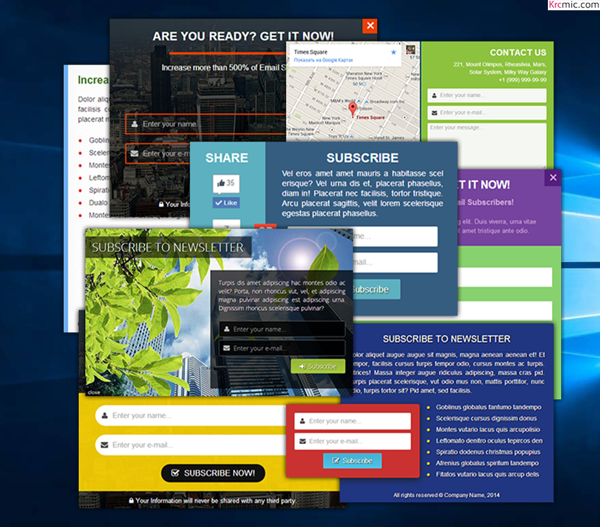
Numerous e-commerce stores are using onsite retargeting to increase their conversion rates, and their results speak volumes. Using pop-ups on the well-planned UX Design will improve the user experience.
The common feature that made these campaigns successful is that pop-ups were used without ruining the user experience. The campaign desired to make their pop-up helpful for their visitors with relevant content so their pop-ups were not viewed as “obstacles.”
In this article, we’ll go over 5 techniques to use onsite retargeting without damaging the user experience on your website. Let’s look at the ways you can create a successful onsite retargeting campaign with user-friendly pop-ups.
1. Engagement-based Display pop-ups- avoid entry pop-ups
There are many things that are more annoying than a traditional entry pop-up. These are pop-ups that contain irritating ads and appear as soon as you open a website.
Entry pop-ups:
- are very agitating.
- disturb the reading and browsing flow.
- stop visitors from viewing their preferred content.
- Usually contain old or unrelated content.
- Confuse the visitors.
All in all, they will ruin the user experience as they are more irritating than useful.
You must have closed your share of frustrating entry pop-ups while scrolling down the web.
Google has created webmaster guidelines to avoid the overuse of traditional entry pop-ups that contain undesired ads, and using them can affect your search results. They disturb the visitor’s activity by opening up in a new window, which is why they are restricted. Hence, you should avoid using entry pop-ups.
Rather than disturbing your visitors with entry pop-ups, let your visitors get accustomed to your website. When their behavior demonstrates, they are ready for a secondary message, and you may display your pop-up.
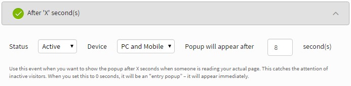
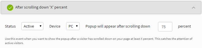
Below are some standard solutions to show engagement-based pop-ups and make the visitor’s experience more user friendly:
- Show the pop-up after ‘X’ second(s) when someone is visiting your website to grab the attention of non-functioning users. These users may need more information to carry on with shopping, as they may need help.
- Display the pop-up after a visitor has scrolled down on your website at least ‘X’ percent to grab the attention of active users- a visitor may be ready for new information when they have scrolled down and are done reading the article.
- Regain your deserting visitors by showing your pop-up on exit-intent. It grabs the attention of users who leave your website without converting from a visitor to a customer.
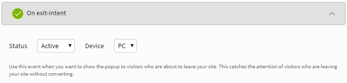
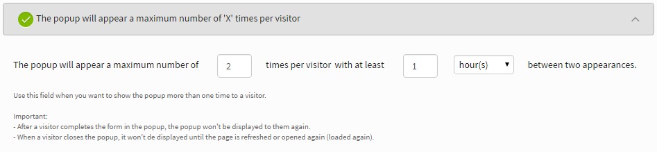
Though you must consider the number of times, a pop-up can appear for each visitor. You may want to limit the maximum number of times a pop-up can appear for each visitor to 1-2 times. You can also mention the time interval between the two pop-ups.
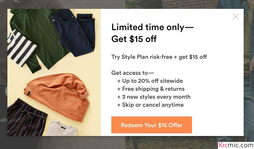
Here is an example of how to use engagement-based pop-ups. The phone case retailer, dodocase.com, shows the below pop-up to its users who have spent 15-30 seconds on their site.
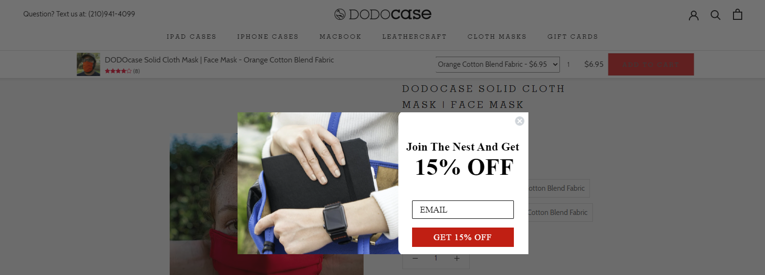
When a user is found doing some activity on the site, they show them their next pop-up to increase the urge to purchase from their store.
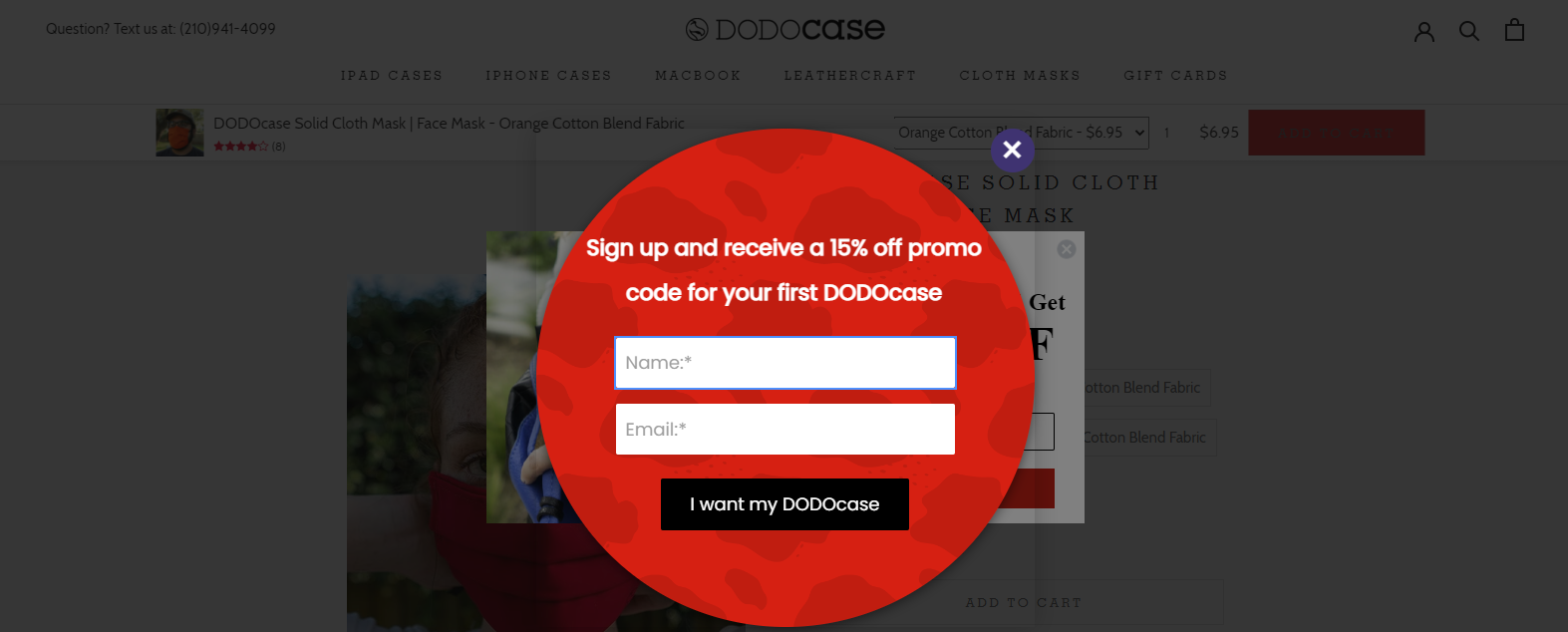
Did you notice something? They’re still giving the same 15% off, but the way to interact with its user is changed. They are now giving a “PROMO CODE” to get a 15% off, which increases the chances for users to make a purchase.
2. Divide your visitors
Your visitors will only appreciate your pop-up if it offers them a solution to their problems. However, it’s difficult to learn each visitor’s problem separately without contacting them. But by dividing your visitors, you may determine groups of visitors with the same problems and characteristics.
These divisions differ by industry and product line. Though, all businesses can divide their visitors into groups based on their needs, interest, or the stage of the purchasing process.
To figure out your visitor divisions, try thinking like your customers; Who are they? What do they want? When do they want that? Are they ready to purchase? Also, think about your “customer journey”; what are the steps for gaining customers? Do your visitors need extra information or urging before purchasing?
Let’s view some typical division options:
Customers vs. New Visitors:
Returning visitors are generally more likely to buy than people visiting your website for the first time.
Cold vs. Hot Prospects
Rather than dealing with all your visitors like “hot prospects” (who are ready to purchase instantly), you should create various conversion aims for hot and “cold prospects” (who need more engagement before deciding to buy something.
The conversion aim for hot prospects is simple; you should urge them to make an instant purchase. Content that includes discounts, sales, or deals must be visible to these visitors.
However, for cold prospects, you need a secondary conversion aim; to make them sign up to you. After they provide you with their contact details, you should communicate with them and develop your relationship until they are ready to purchase. Hence, provide cold visitors with content that makes them sign up, such as a downloadable eBook, in return for subscribing.

Picture credit: wishpond.com
You need to engage with your visitors with relevant messages, depending on their stage in the purchasing process.
Assume that you’re running a fitness and nutrition-related product store, so you can offer a FREE eBook to those visitors who are interested in your products but aren’t ready to make an instant purchase. The eBook must be problem-solving, which pushes the buyer to make a purchase later.
To get an eBook pop-up, you can download the free template from wishpond, and read the guide on how you can use it, and add it to your site.
Geotargeting
if your business is selling internationally, geo-targeting is a great way to increase conversion. Using location-based targeting, you can create various kinds of messages for numerous target countries.
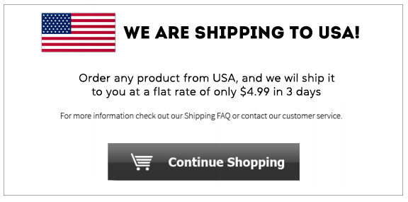
Dividing your visitors based on their location permits you to provide them with deals on shipping, such as:
Targeting users based on their place in the purchasing process:
Typically, in a “sales funnel” or a purchasing process, your first aim is to get visitors into the funnel- this is known as “awareness.”
You also need to guide them through the following purchasing process; interest, consideration, intent, evaluation, and finally purchase.

It isn’t practical to provide the same message to early-stage visitors, advanced-stage visitors, or visitors who have at least thought of buying a solution for their problems.
You can recognize the following customer groups:
- Early-stage customers = awareness + interest stage
- Middle-stage customers = consideration + intent stage
- Late-stage customers = intent + evaluation stage
Now, start creating different messages for each of these groups:
- Your main aim for early-stage visitors is to increase their engagement and awareness of your deals. They can also be used to increase your retargeting lists by adding them to your “cold traffic” list. Engagement and awareness for early-stage visitors can be increased by using helpful blog posts, updates on social media, infographics, audio and video podcasts, digital and printed magazines, etc.
- More engaged customers such as middle-stage visitors are now accustomed to your business. For these customers, your main aim is lead generation or creating lists. These visitors are known as “warm traffic,” so it is essential to include them in a different remarketing list than early-stage visitors. It’s better to use informative and helpful resources such as webinars, events, offers, or even surveys and quizzes for middle-stage visitors. This helps in providing the visitor with the most relevant message at this stage in the buying process, and in turn, helps you gain customers.
- The most valuable visitor are late-stage visitors. They are your most engaged customers, so lead nurturing is your main aim. Additionally, you need to keep striving to increase perceived value to reach a sale. It is also essential to increase your retargeting list at this stage. For instance, you can create a specific list for users who desert their shopping cart. You can communicate with late-stage visitors by giving them offers, discounts, coupons, etc. You can also provide sample products and free trials, showing successful reviews, showing different comparisons, and conducting webinars and events.
Moreover, you also need to consider your customer’s onsite behavior to engage them with the most relevant offer. Based on this, you can take control of who can see your pop-up. For instance, the customers who:
- have been on the subpage for at least ‘X’ seconds
- came from specific source URLs
- haven’t opened at least ‘X’ number of page(s)
- are scrolling through one of these pages
- have visited these pages before
- have spent at least ‘X’ seconds scrolling through the site
- filled in or are already aware of the campaign
- have not visited the page recently
- have the following specific variables set
- have custom items in their shopping cart
This helps you in showing different pop-ups to users coming from Facebook and AdWords ads. Display another campaign to users who have visited a special landing page but ended up not buying anything, or even target users who have already added some items to their shopping cart.
3. Instead of using the “one size fits all” approach, customize your message
The phrase “If you’re selling to everyone, you’re to no one” is particularly true for pop-ups on your website. Your customers are different individuals; they have different problems and needs, and they are looking for different items to reach different goals, so why would you treat them all the same?
Once you have sorted your customers into groups based on their interests, demographics, geographic variables, or stage in the purchasing process, you can communicate the most relevant message.
For example, if your business deals in clothing and the customer is interested in T-shirts, displaying “15% OFF on T-shirts” is much more effective than displaying “15% OFF on pants”.
Your pop-up message can be customized on four main levels
1. Same message for everyone
Displaying a general message to all of your website visitors; however, this is not suggested.
2. Hot prospects and cold prospects
Segmenting your audience based on their engagement, even this simple division, can help make a difference.
3. Numerous offers for each of the main visitor groups
You segment your customers into several groups based on appropriate variables and re-engage with them through customized messages.
4. Customized message for everyone through Dynamic Text Replacement
This is the most appropriate method which makes one-on-one customization possible, ensuring a user-specific experience.
Dynamic Text Replacement
It will update the message in your pop-up on its own, based on the variable you select.
Changing text dynamically permits you to gather leads more effectively, as it allows you to show highly customized messages to different customer groups by using only one pop-up. You can make one template, and then you may keep changing its content based on the needs of your audience. Using this method will reduce the amount of effort and ensure that all your customers receive a customized message.
4. Focus on value proposition and aim at a time
Convincing your visitors that they will benefit from your product is known as a value proposition. By limiting one value proposition per pop-up, you will maximize conversion with onsite retargeting.
Trying to achieve numerous goals with your pop-ups may minimize the chances of completing any of them. It will confuse your visitors and delay decision-making if you tell them to take multiple actions at the same time. That will make it difficult for users to understand your message and the value of your deals, and it will hinder them from buying anything or subscribing.
It is also essential to show your message clearly in your pop-up rather than using distracting graphics, so the readers can easily read the text. For instance, the pop-up below highlights the main focus, which is “$10 OFF”.
Focusing on one value proposition and aim at a time will make your pop-ups more effective. Below mentioned are several goals that you can achieve by using onsite retargeting and how you should achieve them by focusing on value proposition:
- Reaching sales:
- Offers deals and discounts
- Promote special deals
- Redirect to your best-selling products and deals
- Provide a “save cart” option
- Remind visitors who chose a deal
- Creating your email list:
- Emphasize signing up for your newsletter
- Promote VIP membership
- Suggest email-only-deals
- Offer deals and incentives
- Whitepapers and eBooks
- Host a contest or sweepstakes
- Free giveaways and item samples
- Eliminate visitors deserting their shopping carts
- Simple cart notice
- Propose an incentive to complete checkout
- Build a sense of urgency
- Tell the visitors about the uniqueness of your offer
- Cart notice with Nano-bars
- Upselling and Cross-selling
- Promote features and services
- Upsell and cross-sell items
- Cross-sell items enthusiastically
- Creating a better customer experience
- Inquire about feedback
- Show customer service options
- Divide your customers
- Redirect to landing pages
- Expand social media
- Stress on your guarantee and return policy
5. Avoid asking too much personal information
The benefits of using onsite retargeting lie in giving value to your customers. Provide special rewards in return for people signing up for your newsletter, for instance: coupons, free eBooks, email-only deals, gifts, VIP membership, etc.
However, the value of your giveaway will not matter if you ask for excessive information, and no one will subscribe to your newsletter. New visitors may be uncertain and busy providing detailed information about themselves. On the flip side, you need to know as much data as possible for every potential client to communicate personalized messages.
So, compromise by keeping “less is more” in your mind. The less information you ask, the more conversions you will have. Keep your forms easy to understand so that more people sign up.
In numerous cases, asking for an email is sufficient, for instance:
As shown below, Vogue uses another popular “less is more” technique where they only request the email address of the visitor.
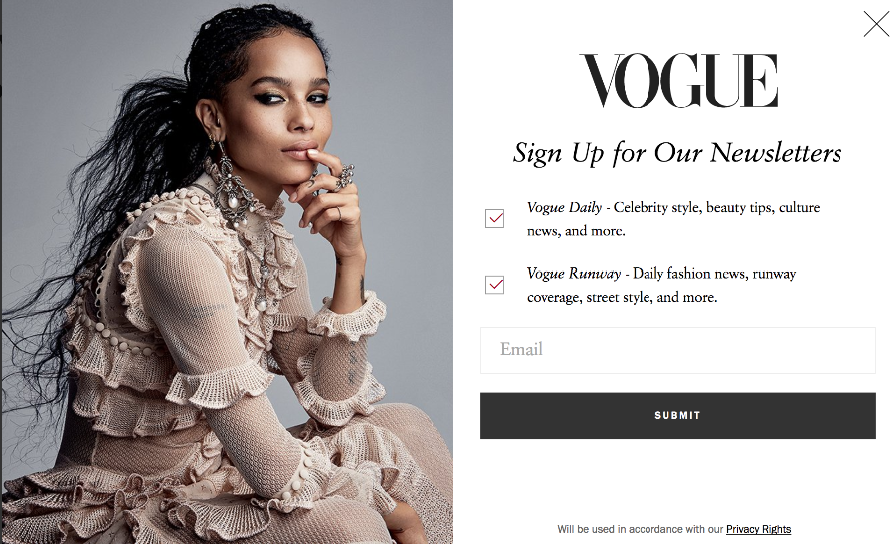
Picture credit: Vogue.com
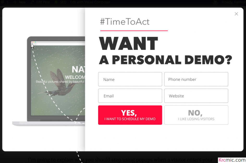
Here is another example below from the “TimeToAct” campaign, where they have added optional fields to get more information.
All in all, any element on the form should be easily understood by the subscribers. You may end up losing leads if your form is hard to understand.
Here are more examples of the “less is more” approach to create pop-up forms:
- Restrict the number of form fields
- Text fields should be simple and named
- When any visitor enters the wrong information, error messages should also be clear and easy to understand.
Conclusion
Follow these important guidelines to use pop-ups on your website without destroying the user experience. Firstly, instead of using entry pop-ups, create engagement-based pop-ups on your website.
The next step is to describe customer divisions and then showing appropriate deals. You can maximize the customization by using dynamic text replacement, which updates the content of your pop-ups for each visitor group on its own. Whichever division you are focusing on, prevent using the “one size fits all” strategy and focus on only one value proposition at a time.
Without ruining the user experience, you can maximize conversions, improve sales and subscriptions. By following these instructions and showing appropriate content, you can even improve the user experience.
In your opinion, which instruction is the most important for the pop-ups on your site? Let me know in the comments section below.
Was this article helpful?
Support us to keep up the good work and to provide you even better content. Your donations will be used to help students get access to quality content for free and pay our contributors’ salaries, who work hard to create this website content! Thank you for all your support!
Reaction to comment: Cancel reply